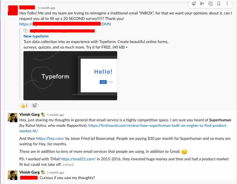
As I have been tweeting about my experiences with poor or broken products, this is a quick reference to a few of those merchants who write the code in the plastic bottles and throw it in the oceans because they do not need a license to do that.
01. Eventbrite—Design and experience
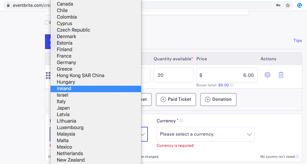
Design and Experience: I saw many of my friends using Eventbrite for their events, and I thought of trying it to host my own event. After spending a couple of hours, I found that the service is NOT available in India.
That sounds crazy—why the product cannot tell me at the sign up itself, or at the first step when I started creating my own event?
It shows only at the last step when I am ready to publish my event—selecting the country is mandatory and India is not listed.
The was the cake. I tweeted and they never bothered to respond; this is the icing.
PS: The footprints are seen in the community too.

02. PayU India—The three-sixty degree Sh*t
I registered to see if I can use the payment gateway for the ticketing system on my UX conference website. The product and the entire onboarding is totally broken, they do not have any clue of what the customers are trying to do.
After I told them that I do not want to use the service within the first week, I got the following email.

The support is hopeless and they never asked why I wanted to quit. The best was yet to come.
Out of the blue after four months, I got an email from their dysfunctional support that my query is resolved.
The was the cake. They never bothered to respond to my tweet; this is the icing.
03. BricsMath—They are in wrong business
I enrolled my eight years old son to BricsMath for some playful activities around problem-solving.
In the first week of June, I forgot the password and I could not log in even with the new password. When I wrote to their support team, they sent me my original password in the email itself.
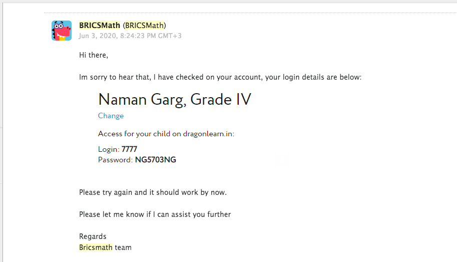
This is a huge security loophole that their employees can see my account’s password. The fundamental principles of designing the sign-up flow in a product are violated.
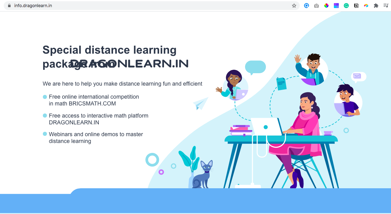
The was the cake. I wrote back to them, and they did not reply. After a few days and out of nowhere, I got an email from an unknown domain—dragonlearn.in (LinkedIn) that I could log in there to check my BricsMath score. Absolutely no context, or communication, or clarity. This is the icing.
PS: Look at one of their taking-off pages. And they are a product company?
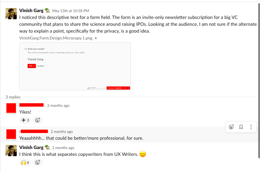
04. Form design
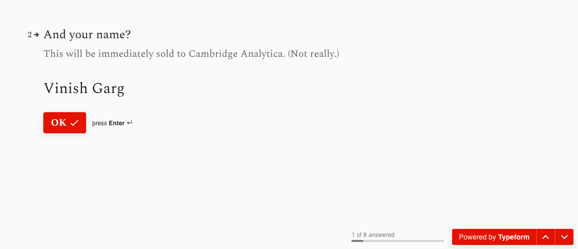
This is the form of an invite-only VC community newsletter.
The wit is a bit too far when it says—This will be immediately sold to Cambridge Analytics (not really)!
The audience uses their own judgment and they carry their own bias when they interpret the meaning.
Since this is coming from a brand, I wish they were more careful in the form’s content. As I shared in a Slack workspace where I am part of, this is what separates copywriters from UX Writers.
05. Sign Up: Airmeet
Airmeet claims that they host digital events. In the signup process, the password (****) annoyingly overlaps with the label text, and they do not even care when reported.

And can you see the little timer that shows only a few seconds are left to enter the code and so submit the form? It defies all common sense on how to let users in.
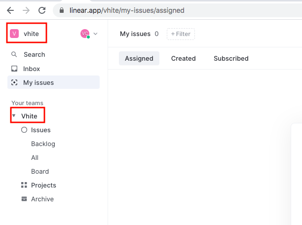
06. Vhite vs vhite: The Rocket Science
So many services change my agency name from vhite to Vhite, and I do not really understand it. Bigger companies including MailChimp and Airtel did that, and now Linear too.
MailChimp never replied to my tweet.
Here is an example from Linear.
07. Sign up
How do I know what validation I might be missing out!
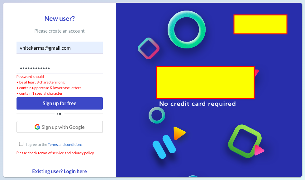
08. Sign up
And one more sign of yet another plastic bottle in the ocean. First, it tells me about the number of characters.

When I complete the condition, it shows the next condition.

As if I am logging in only once. And I actually logged in only once, true to the merit.
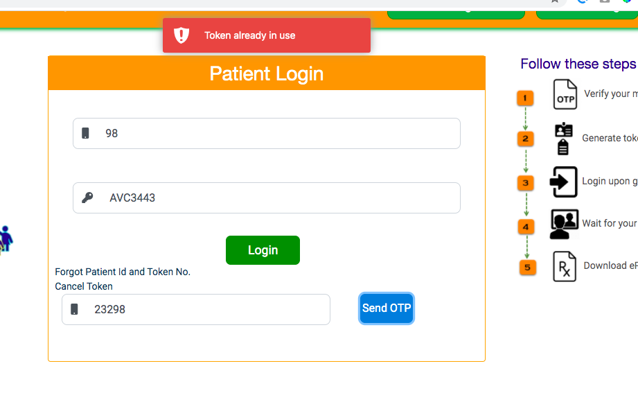
09. Sign up: eSanjeevniOPD (by Govt. of India)
The ambitious project by the government of India starts on a questionable premise.
Red Flag: The first step is to share the phone number to get the OTP, they do not talk about data privacy at all.
I enter a two-digit number and they ask for the OTP.

If I enter a wrong OTP, they show a message that the OTP is expired.
The OTP cycle is a mess, and I do not understand what is a token, what they want to tell me, and what I should do.
10. Meity and NIC (Govt. of India)
In August 2019, my co-working facility shared the contact details of all the startups and consultants with Meity India (with our permission) for one of their events. And they started sending promotional emails without an option to unsubscribe.
I wrote to them, and see what they reply.
November:

January:
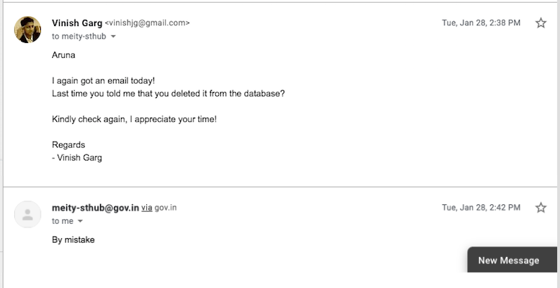
March and April:
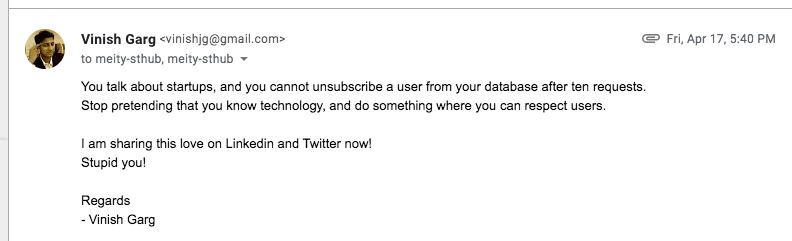
And in July too.
The was the cake. They never bothered to respond to my tweet; this is the icing.
NIC is broken in many more ways as well. (See slides #6 and #8 of my past experiences with NIC, they are in the wrong business.)
Last month, I registered for a Smart Cities webinar by Smart Cities Mission, Government of India. I could not even attend it because it required a Chrome extension. I wrote to them and tweeted too (NIC is their tech partner or enabler or destroyer—a friend in all cases), but they never replied. I have many more examples of how this NIC thing is broken.
11. Mission
Yes, our fascination with a mission statement. The world’s best, world’s leading, world’s first, and best ever. Born to lead with adjectives.
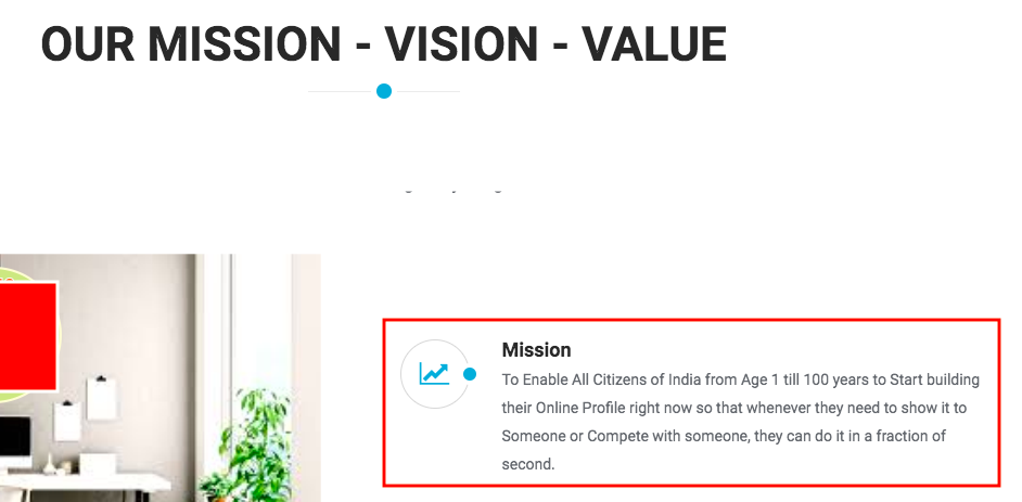
Online profile for all citizens of India from age 1 to 100…. in a fraction of a second?
12. Airmeet—The experience
Well, I shared Airmeet’s sign up experience earlier. The experience is equally broken inside as well, as I shared it in this Google drive document.
In another case, while attending an event by Redpoint Ventures on Airmeet, I see a strange issue and I tweeted. True to being an omnichannel broken experience, they never replied.
13. Login up?
This is code reuse at best, or maybe nocode with all the eyes and ears closed.
14. Medium
When I am logged in to Medium, I see an option to mute myself.
I did not try to mute myself to check how it works because I am not sure if I will be able to unmute myself later. Their support article does not talk about this use case. I tweeted, but they did not respond.
15. Content models—Schools product
While paying the school fee for my eight years old, I notice that the duration of each quarter in the financial year is the entire year itself.
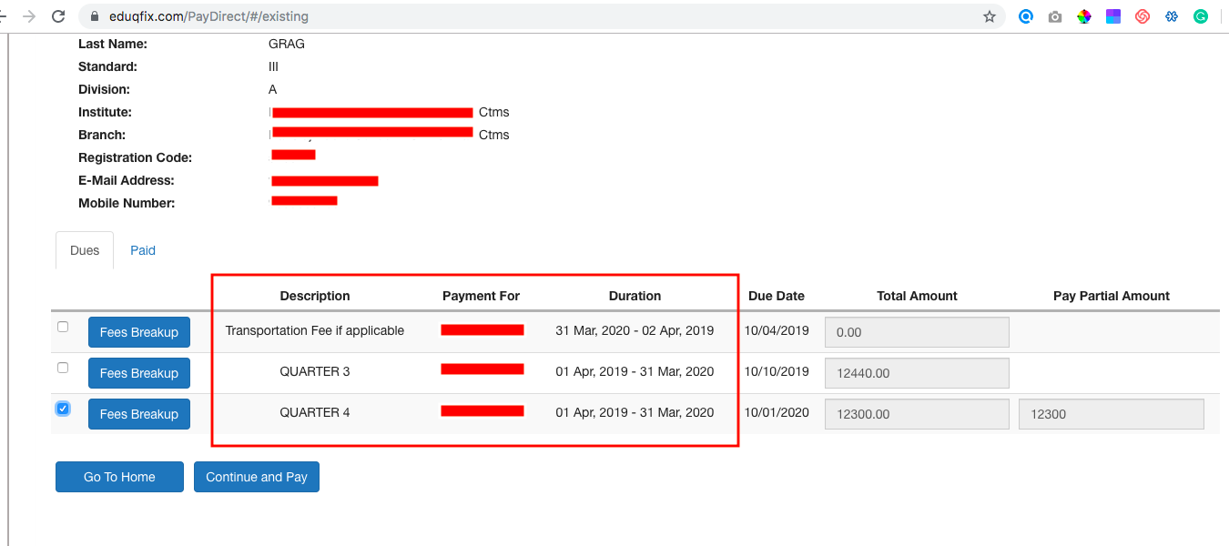
I tweeted and then never responded.
16. Phone number required for sign up
I see so many products asking me for my phone number which is not their business at all.


This is the cake. If the product has an interesting use case for me, I write to their founders and they never reply. This is the icing.
17. Townscript
Well, Townscript has been iconic in so many ways. The product appears and behaves as if it was designed and developed in 2005, absolutely zero sense in the forms, interactions, validations, and the messages. The support team is a bunch of jokers, here is an example.
Can you see how a template-dressed human is responding to an irritated customer (and this was NOT the first time)?
I wrote about it in my SubStack post, and I tweeted too.
18. Naukri—Different OPTs for each device
I have an employer account at naukri.com and every time I try to log in, I get an OTP. Can you believe that for every login attempt in the last one year, I get two different OTPs—in my email and on my phone?
I can use both the OTPs to log in successfully. I think it is so complex to do it programmatically, to send different OTPs on each device for the same trigger?
This is the cake. I tweeted and they never responded; this is the icing.
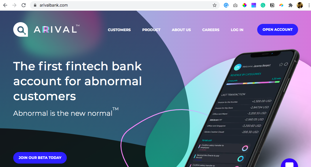
19. A bank’s positioning
A bank for Abnormal customers?
20. Courtesy
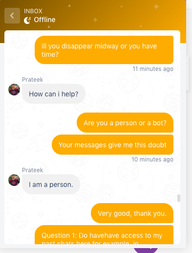
Sometimes I participate in quick surveys to help founders and tech leaders to validate their idea or process, or plan. There are a few classical examples that if I try to share my own related experience, they never have the courtesy to reply. Not even after a follow-up. Here is an example.
21. Survey design by Twitter
Survey designing is such an art as a survey opens a conversation with an audience. Accurate and relevant data can be the fuel that the product team needs for its strategy.
In this survey by Twitter, none of the statements in the two options are clear enough.
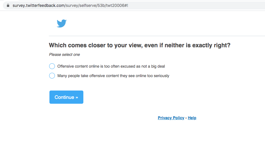
I can imagine that many users would just answer anything randomly and the Twitter product leaders might end up rewriting their code for something that the audience never asked for.
And see how the community talks about their surveys; sometimes it goes far beyond the survey itself.

22. Survey design—the UX
The logic jump from Q5 to Q6 in a UX Writing survey. Really?

23. Strong enough
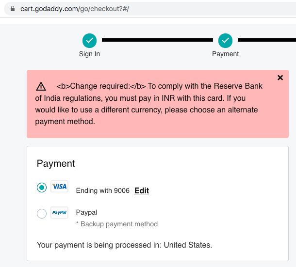
The payment page of GoDaddy shopping cart shows the content that is meant to be bold, but not bold enough. I am noticing this issue for at least 6–8 months now.
24. Logged in or logged out?
I am logged in here and it asks me to sign up.
I think the product team never registered and then saw the landing page (or take-off page if I should call it).
25. Privacy—Cisco WebEx Chrome extension
To attend a webinar, I saw this option to install the Cisco WebEx Chrome extension. It says—It can read and change all my data on the websites that I visit.
Really?
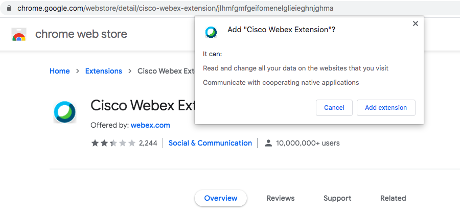
I tweeted, and they never responded.
Likewise, I do not understand why On24 wants to control my entire Twitter account.

26. See around
You will find #26.
I have done countless teardowns in the past in a mix of tweets and blog posts, right from Snapdeal, Flipkart, Airtel, ICICI Bank, and most recently for Hey.com.
I am a bit tired to see all this, and so I am closing it here.
May the better sense prevails soon, everywhere. I will dive again with yet another net. Some day.
