[Updated on 03 July: If you see the complete post, I mentioned that Hey might work amazingly for its utility and value for money. However, there is enough voice on the Internet that Hey is poor from a design perspective (example).]
I am following Jason fried for their blog for a long time now, I saw it moving from medium to their own hosted domain. I used Basecamp ten years ago. I follow Jason on Twitter, and I admire him for his clarity of thought in running businesses. When I asked, he responded.

So, when they announced Hey.com in February 2020, I requested early access and I got it a few days back (before it was available for public).
For Hey: Design fails = Product fails
I will not get into the schematics of Hey as an email as service or Hey as an email client (as Nathan Baschez has dug it deeply), or the unit economics, or the business model.
I am looking at it purely as a possible customer with my subconscious bias towards the product experience. I ran a twitter poll and even if it got three votes, none of the participants picked UX as the reason here.
Note: I am on Product Hunt since 2013, and I have reviewed hundreds of products and spoken to hundreds of product leaders worldwide. I completely understand how new product teams invest in the experience and in the matrix of usability vs utility.
But here we are talking about something shipped by Jason Fried and Basecamp! Look at the buildup in the last four months on Twitter.
But.
Promise and affordance go hand-in-hand.
Where is design
When I have no new email in Hey, the interface bothers me. As if it looks into my eyes in a dark white room. There is no reason for an email service interface to show it this way and in this much of space. Sorry.
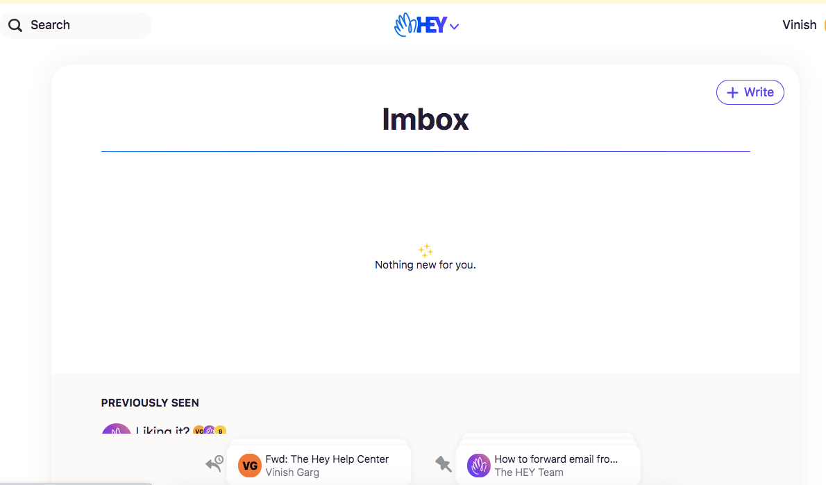
The navigation is poorly designed and I am not even sure where is my mouse hovering now. Just enough clarity is poor usability by their team’s standards.
Information architecture
Trash before Everything?
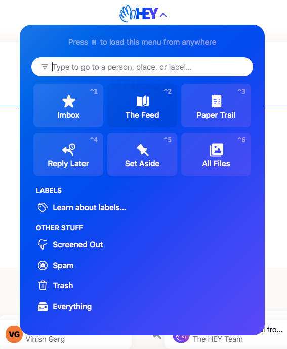
Hey says that they are trying to raise the email utility standards, here I am not sure of the information architecture.
The way menus show options without any grouping by colors or structure, shows a lack of design-culture in the team.
Many product teams who are much smaller than Basecamp invest in a minimum viable design system and scale it as they grow (here is a comprehensive listing), I am interested to know the design standards or systems used by the Hey product team.
Content design, UX writing
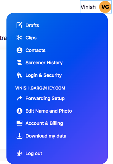
The Screener History does not guide me on what to do here.
They hide the most important function of this page behind that key icon at the top, and it makes no sense at all.

Their support team is answering thousands of support emails and a common-sense design could have avoided many of those.
Context switching
I have five more tabs open in my browser including for Airtable, Notion, Skack, XD, Gmail, and Medium of course. The entire visual experience of Hey for its typography, colors, and the way it invites attention seems out-of-design-context.
Hey.com might not be competing but people tend to see a product as a dot in their browsing experience orbit.
Hey appears to be out of place and out of context. Out of colors too.
The saving grace
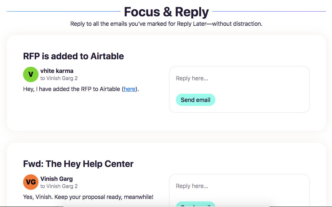
The one magical saving grace is that I can reply to multiple emails in a single interface, without going anywhere. For sportspersons, this is certainly a winning shot.
Is Hey into validation?
Hey is new.
The way it invited attention, I would not call it in the validation stage per se.
Hey might work amazingly for its utility and value for money.
If it fails in design when shipped by a mature team, in 2020, it bothers me.
When I think of a new car, I might be excited to see videos of the dashboard, high-quality parking cameras, or radar cruise control. If the design fails me, the product fails me.

More readings on Hey (not related):
- Tackling the unsolvable problem (The New York Times)
- A quick crit of Hey email (Adam Silver)
- Will Hey work? (Nathan Baschez)
